What is the slider on the map for?
The slider is used for convenient and fast comparison of data for individual time periods. Usability is, for example, in the display of sales for individual quarters, between which you can easily switch.
Possibilities of use
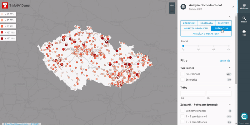
1. Points
One of the possible uses is when displaying points using the visualization “Breaks” (the color and size of the point is given by the numerical value of the point, eg sales). By dragging the slider from one period to another, you can see the development of individual points over time. You can quickly and clearly obtain information on whether the selected indicator increases, decreases or stagnates in certain periods.
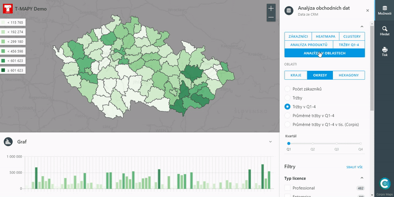
2. Aggregation
You can also use the slider to compare the evolution of the indicator over time in territorial units or your business regions. In this case, dragging the slider also updates the graph below the map. To get the most interesting information, we recommend combining the slider with filters.
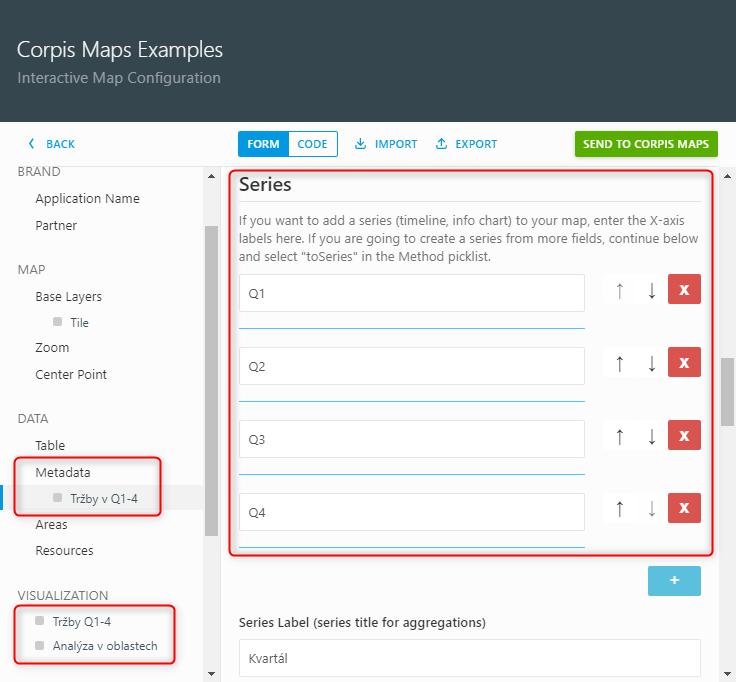
Corpis Maps Creator
In the map configuration tool, create a new entry in the “Data – Metadata” section. Here you create a scroll bar for the data you have selected (you can edit the labels on the scroll bar as you wish, eg Q1 or Q1). Then just add the created slider to the map (in the section “Data – Visualization”).
Are you interested in this feature and would you like to use it in your maps as well?
You have immediate access to the function in the Corpis Maps Creator configurator under your account, where you can create or edit analytical maps yourself. Alternatively, contact us or your Corpis Maps Solution Partner, who will be happy to help you create the map.