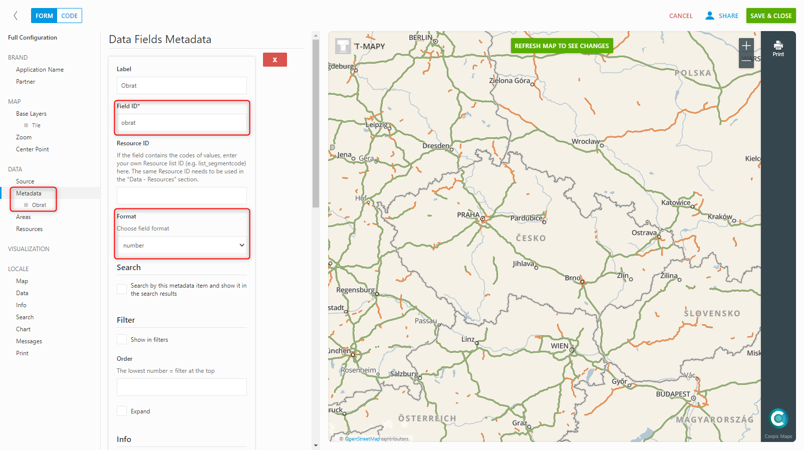
The breaks visualization is used to differentiate points (customers) according to the numerical value of the field from the data.
The numeric field according to which you will create this type of visualization must be added in the “Data – metadata” section. To learn how to add new metadata to your map, see “Add new metadata”.
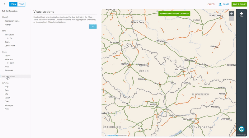
Add a new visualization in the “Visualization” section, name it and select “Breaks” in the “Renderer (non-aggregation)” options. After selecting the given type of visualization, it is necessary to fill in the fields “Field” (enter the name of the field from the data you have added in the metadata) and “Radius” (range of point sizes), which we recommend to initially set for the smallest size 4 and the largest 12. Optional items is statistical method of division into intervals (“Method”), number of intervals and sequential color scale of points. After setting all parameters, confirm the changes by clicking on “Refresh map to see changes”.
Are you interested in management maps Corpis Maps?
Contact us and try Corpis Maps for 1 month for free. During the trial period, we will create your first map for free.