The values visualization is used to color-code points (customers) according to the code values from the data.
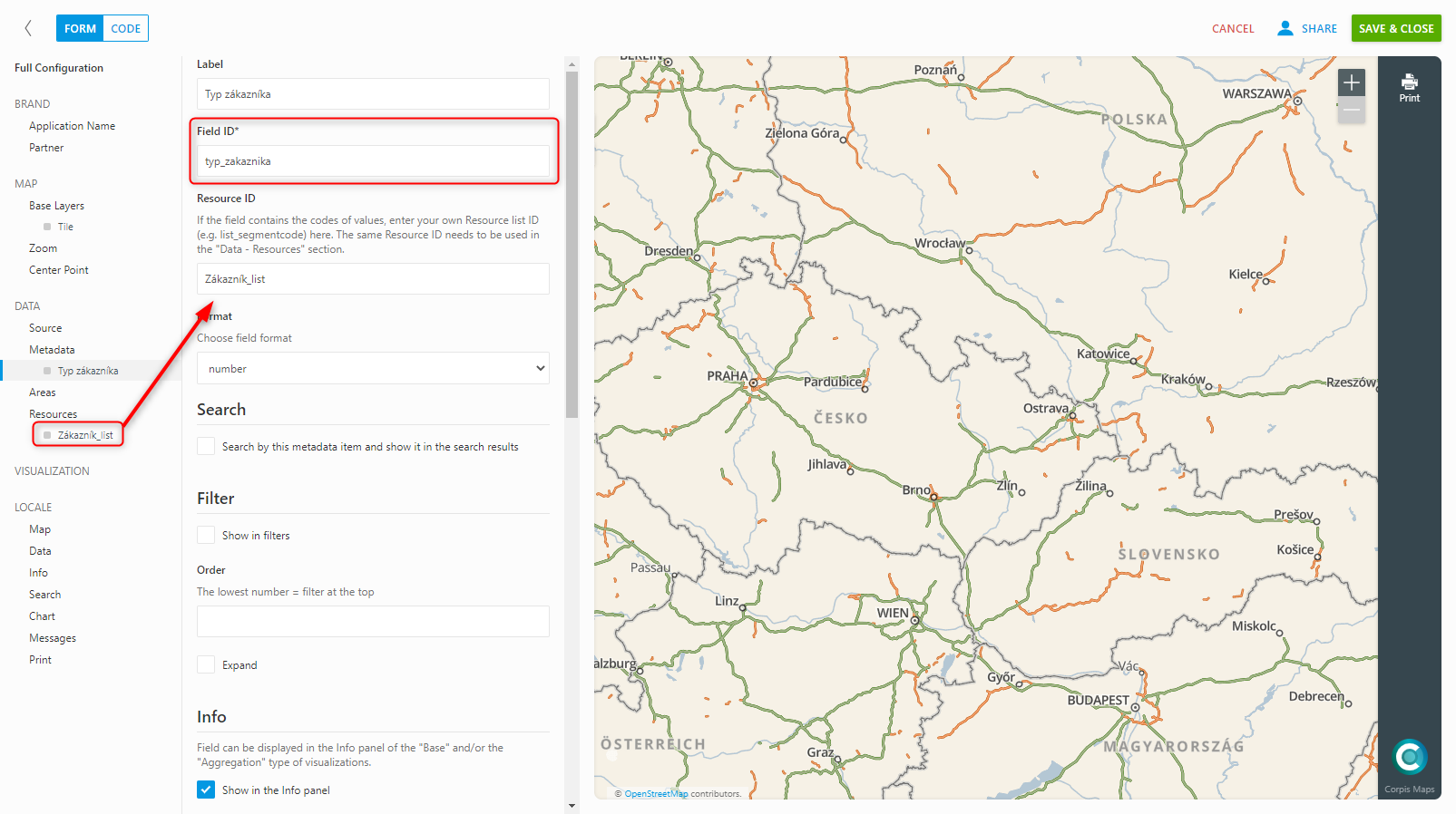
The field according to which you will create the visualization must be added in the “Data – metadata” section and you must attach the created code list of values to it. In the code list, it is necessary to assign a color to the individual items, according to which the points will be colored when creating the visualization, or to select the size at which the point will be displayed.
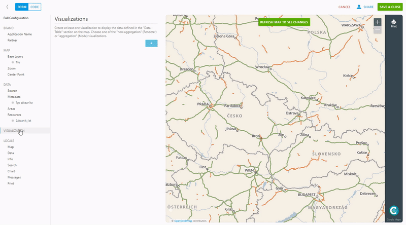
Add a new visualization in the “Visualization” section, name it and select “Values” in the “Renderer (non-aggregation)” options. After selecting the given type of visualization, it is necessary to fill in the “Field” field (enter the name of the field from the data you have added in the metadata). The “Default symbol parameters” option sets the default point size and color. If you create a visualization of the “Values” type from a code list that does not contain all the values of the given field from the data, then those values that are missing in the code list will be displayed in the default color and size. After setting all parameters, confirm the changes by clicking on “Refresh map to see changes”.
Are you interested in management maps Corpis Maps?
Contact us and try Corpis Maps for 1 month for free. During the trial period, we will create your first map for free.