With regard to the current development of coronavirus in the world and the Czech Republic, the Corpis Maps team decided to join hands and create a SPECIAL ANALYTICAL MAP for JOURNALISTS AND MEDIA monitoring the development in individual countries over the last day. The aim of this map is to make it easier for the media to identify and derive important information, facts and trends from complex coronavirus datasets.
What makes the map unique?
The map shows the latest events, developments and trends in individual countries of the world for the LAST DAY.
What information can you get?
In a few seconds you will have the answer to the following questions, for example:
– In how many countries have more than 100 people died in the last day? Which countries are they?
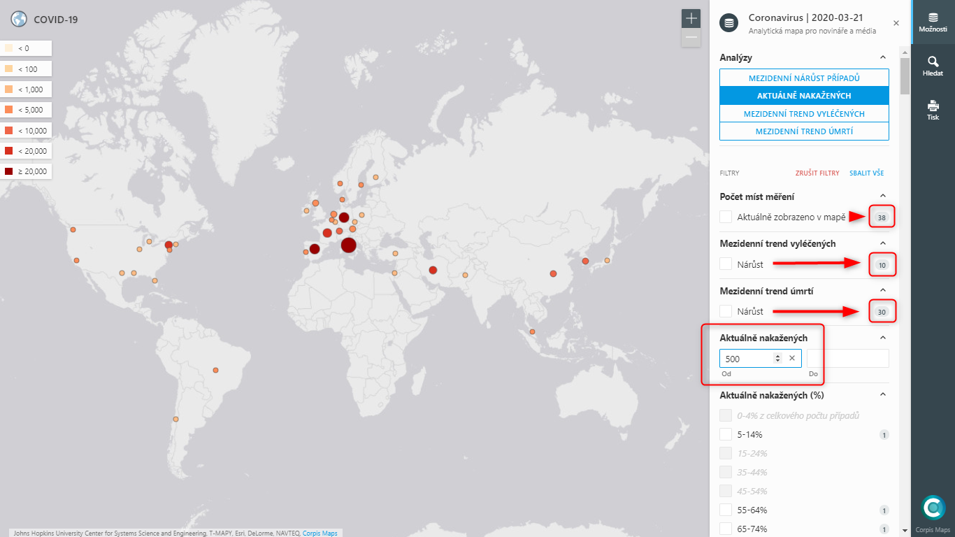
– How many countries (38) are there where there are currently more than 500 infected? In how many of these countries has anyone recovered (10) or died (30) in the last day? See figure below.
The number on the right in the filters always indicates the number of countries, that correspond to the set filters!
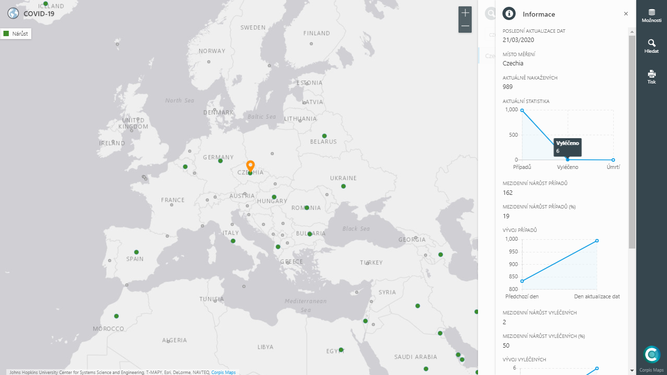
– How many people are cured in the country “Czechia”? By what percentage has the number of cured patients increased in the last day?
– In which countries are up to 1,000 infected and the number of people cured has increased by at least 10 in the last day?
– In which countries are currently the least infected out of the total number of cases, ie “Currently infected (%)”?
– and many others…
What is the data source and how often is the map updated?
The map is based on the official data set of the Johns Hopkins University Center for Systems Science and Engineering (JHU CSSE), which is provided once a day in the early morning hours. We update the map every morning. Would you like to be informed about a map update? Sign up for email notifications below.
What are the conditions for using the map?
You can publish a link to the map, information resulting from the map, including screenshots, without any restrictions. If possible, indicate “Corpis Maps” as the source of the information.
Please send any questions and suggestions for improving the map to info@corpismaps.com
—
Updated:
14.04.2020 – We have added two more language versions (Slovak, English) of the analytical map COVID-19. Links to both maps can be found above.
09.04.2020 – In the COVID-19 map you can now filter states by number of cases per 1 million inhabitants and also by state population.
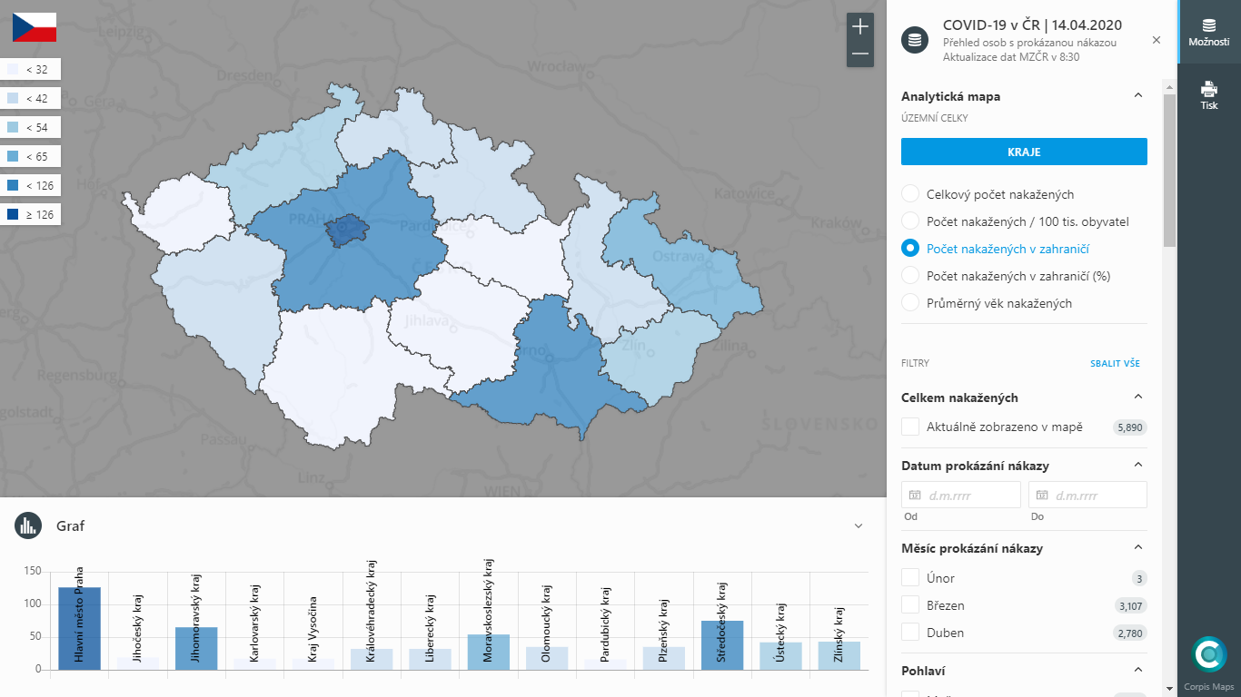
ATTENTION 07.04.2020 !!! – From the official data of the Ministry of Foreign Affairs of the Czech Republic, we created a detailed analytical map of the Czech Republic of persons with a proven COVID-19 infection. MZČR updates the data daily at 8.30. You can look, for example, at which regions there are the most infected men or where, overall, most people are infected abroad. Do you think that more Czech citizens became infected in Italy or Austria? If you are interested in the answer, take a look at our new map.