The graph of the development of the selected metric (for example sales) for certain time periods can be easily added to the info panel, which will be displayed after clicking on the selected customer.
1. Data preparation
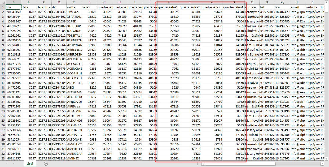
To create a graph, it is necessary to have in the source data the values of the given metric for the selected time period, for example quarterly.
2. Map configuration
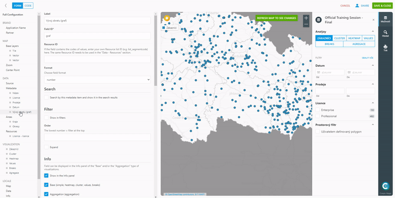
In the map configuration, create a new entry in the “Data – Metadata” section. In this metadata, in the “Computed” option, select the “toSeries” method and add any number of fields (according to the field name in the data) that the graph will consist of. Rename the individual time sections of the graph as desired, eg from “quartersales1” to “Q1”, etc. Then confirm the changes with the “Refresh Map to See Changes” button and the graph will be created.
You can then create a scroll bar on the map from the created field for the graph. You can find out what a slider is for and how to easily add it to the map in the article „Slider on the map“.
Are you interested in management maps Corpis Maps?
Contact us and try Corpis Maps for free.