Creating an aggregation function
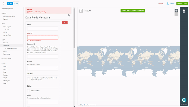
To add a visualization of the aggregation type, it is necessary to add the field according to which you want to aggregate to the “Data – metadata” section. Fill in “Label”, “Field ID” and add a new aggregation function (count, sum, avg, min, max) in the “Aggregation” section. The name of the function you fill in will appear in the info panel after clicking on the selected area. The count function can be used on any field, other functions only on numeric fields.
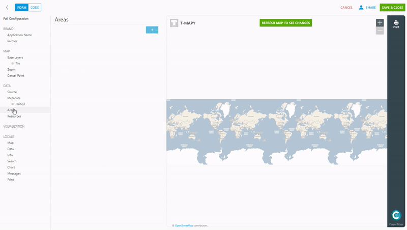
Add aggregation areas
In the “Data – areas” section, click on the blue plus button to add a new aggregation area. Name it and select from the pre-created options (CZ Regions, SK districts, etc.) which territorial division you want to use. If you have created your own business regions, you will see them in the list. You can also set the zoom level at which the labels of selected areas are still displayed (for regions we recommend level 7 and for districts 8). Several aggregation areas can be added.
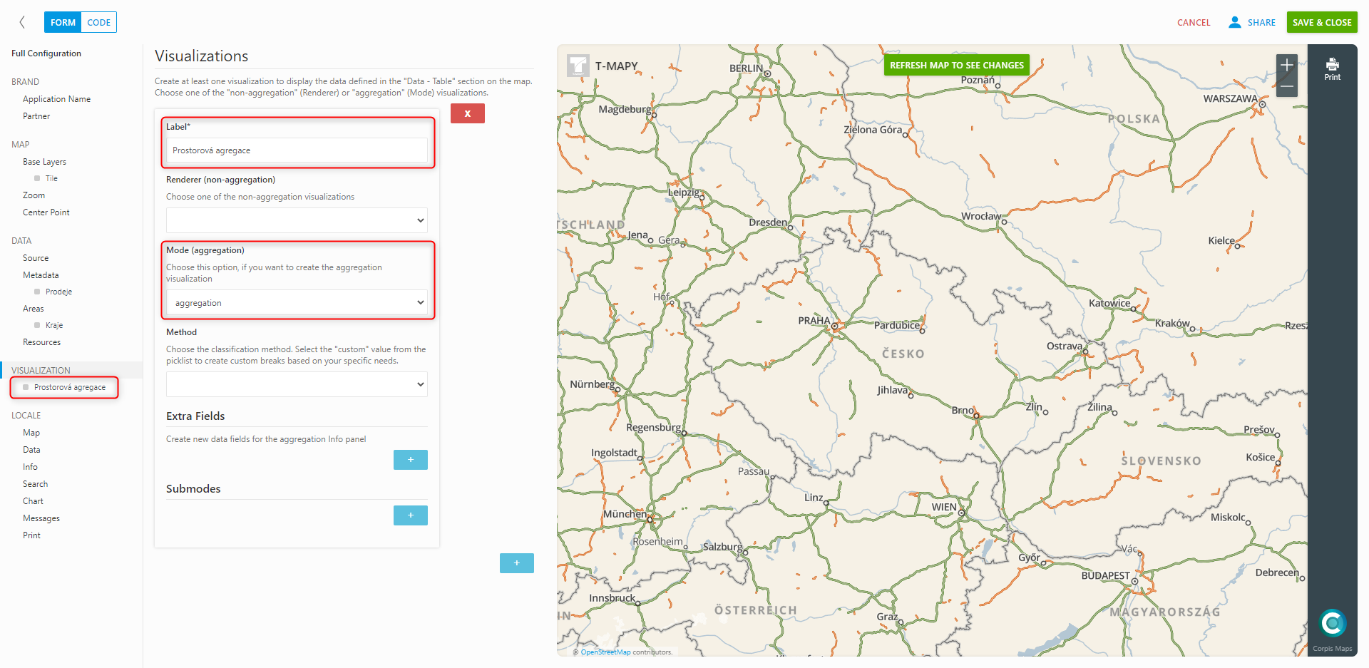
Creating an aggregation visualization
In the “Visualization” section, add a new visualization and select “Aggregation” in “Mode (aggregation)”. Here you have the choice of “Extra field” for the possibility of adding a calculated metric to the info panel and “Submodes”, which will add a new subcategory in the aggregation (radio button).
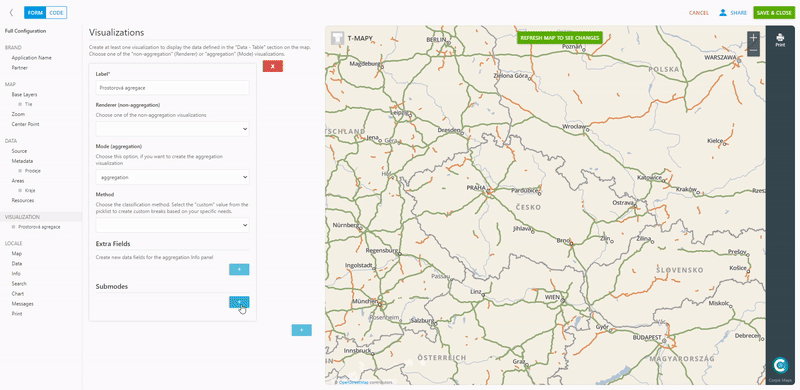
When creating a subcategory, it is important to fill in “Label” and “Field”, in which you write the name of the field (added in the metadata with the created aggregation function) and the aggregation function. E.g. sales.sum (creates sales amounts). For individual subcategories, you can change the color of the created choropleth map, the number of intervals and the statistical method of division into intervals. Click “Refresh map to see changes” to send the changes to the map.
Are you interested in analytical maps Corpis Maps?
Contact us and try Corpis Maps for free.